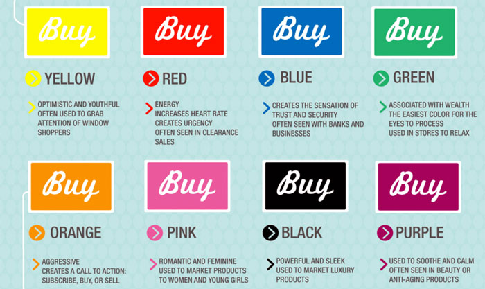
Over the years, a lot of companies have conjured up a wide variety of inventive ways to attract new customers. Some have turned to music, while others have explored new advertising venues. Lately, more and more business owners are taking the time to learn about the psychology of colors.
Colors and their interactions with one another can prove to be enormously impactful and could make the difference between making the sale and losing the customer. Below, you will learn about some of the most amazing color interactions and their benefits for business owners.
Choose Complementary Colors
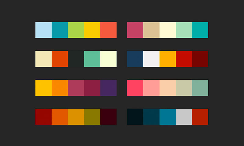
The first thing to remember is that there are complementary colors, which cause each other to become much more intense. These colors lie across from one another on the color wheel. When yellow is placed near a purple, the yellow will immediately become more intense and bright.
For business owners, this can be an effective way to get their visitor’s attention. By placing complementary colors in strategic locations, the business owner will be able to attract the visitor to an ad, checkout button or even an email opt-in page. The possibilities are enormous.
However, it is essential to use these colors together sparsely. Too many complementary colors will make your site too bright and uninviting.
Create A Border

While some people will put a great deal of emphasis on the colors they use, it is also important to consider your shapes. Creating a border is a great way to captivate your visitor and force them to take notice of whatever it is your offering.
Using borders in advertisements is a good way to direct the viewer’s eyes and force them to read the writing. Incorporating the use of complementary colors into the equation is a good way increase the impact of this technique. Try using several square in a much bigger square and see how it works for you.
Blue

As everyone knows, blue represents males and pinks represents females. But, what you may not have known is blue is often the preferred color of men. The reason behind this presumption is that blue is associated with tranquility, water, peace, and reliability. Men like the sense of security and embedding the color in your website content will actually help you promote your products.
Believe it or not, many retail giants and conservative brands utilize blue, because it promotes trust. Even social media giants Facebook and Twitter use blue. However, it must be utilized wisely in order for it to work effectively.
The Color Red

It is also important to remember that certain colors can have a special effect on the viewer. Red is a unique color, which is commonly overlooked by web designed and business owners. This is truly a mistake, because red can be very potent.
The color is capable of stimulating the body, as well as the mind. It can also lead to increased circulation. This will make the user feel energized and awake. Once they see the red color on your website, they’ll be more aware of the benefits of the goods and services your offering. This will make them much more likely to make the investment.
Yellow

Yellow is a very tricky color. In most cases, yellow can be very bright and this could deter the visitor from using your site. However, yellow can be excellent for some cases. This specific color is associated with energy and optimism. It is also often considered to be a symbol of youth, which is perfectly evident in Snapchat.
Therefore, yellow can grab the user’s attention and make them feel optimistic about your products or services. It is also a very effective color for targeting a younger audience. Just remember to use the color strategically. Too much yellow may backfire and send your visitors fleeing elsewhere.
Be Cautious Of Too Much Black

Black has always been considered ominous. Almost everyone connects black with the darkness and this can make it a dangerous color, especially if it is used in large quantities. Studies have analyzed this color when used for sporting teams. According to those studies, teams that dresses in black uniforms were much more likely receive penalties. Therefore, if black is used excessively, it could actually scare people away. However, black can be good in some instances. Using bright, bold colors on a black background is a great way to get the user’s attention and entice their excitement.
Don’t use too much black though. Find a middle ground and allow the remaining colors to take charge.
Green

If you open your eyes, you will see green items everywhere. Grass, leaves, and plant stems are green, which tells you that it promotes environmental factors. It is truly important to embed green coloring into your website, whether it be graphics, images, or just lettering. The main advantage of choosing green is it stimulates harmony and encourages a sense of balance.
This will not only encourage decisiveness, but it will also empower people to make the right decision the first go around. As an example, TechCrunch.com uses green to create this sense of harmony and improve the decision-making ability of their readers, especially when it comes to purchases because this site focuses a lot on technology reviews.
Gray

Gray is not a color that is thought about often. However, it can become a major part of your business marketing strategy. However, it must be utilized wisely and sparingly, since it symbolizes old age, but focusing more on solidarity and practicality.
If gray is utilized in abundance, it could potentially cause one to exhibit depression and feeling of unworthiness. Using gray strategically can prove to be enormously impact. Just make sure you don’t oversaturate your site with this color or your visitors will not appreciate it.
Using The Color Orange Effectively

Orange is the most muted of the warm colors, because is it so versatile. When used as a primary color, it can be energizing and engaging. For instance, if you used orange as the main background of your homepage, it would give off an energetic and exciting feel.
However, if orange is used as a secondary color, it still promotes the same feelings, but in a less obtrusive way. Orange works well very with any kind of cartoonish site and can truly be used almost anywhere.


